As nations and regions plan on restarting their economies and relaxing social distancing restrictions, there have been concerns raised that the data does not support the curve-flattening optimism used to rationalize the economic relaunching. The data for Canada and Alberta hold a selfish personal interest. Monitoring the trajectories of the infection and mortality curves provides insight into any impact this easing of isolation restrictions might have.
Canada Infections
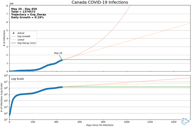
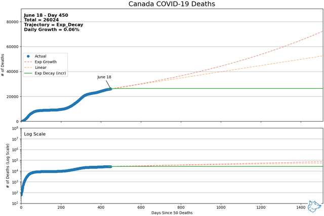
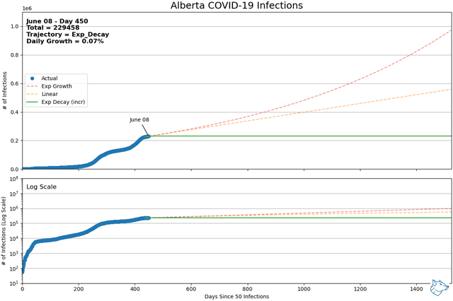
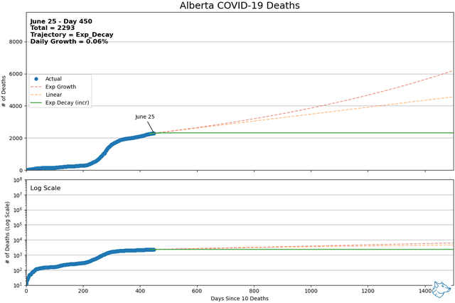
These animations show the best-fit curves between exponential growth, linear, and exponential decay (increasing form) over a sliding 14-day window. Of these three curves, using mean squared error, the best of the best fit curve is identified by the solid line. Exponential decay (green) is the indication of decreasing daily cases and demonstrates flattening of the curve. Linear growth (orange) indicates a steady growth rate and exponential growth (red) indicates the growth rate is increasing with time. The same data is represented with a logarithmic y-axis in the lower plot.
Canada Mortality
The animations for Canada, Alberta, British Columbia, Ontario and Quebec will continue to update daily so long as the server load allows. Comparison animations, at the bottom of the page, will be updated ad-hoc if required.
The analysis is done with python and the curve fitting is done using the curve_fit function from ScipPy's scipy.optimize module. The individual plots are produced with the matplotlib library and assembled into animated gif's using the moviepy.editor module. The following code shows the formulas used for the curve fitting functions.
import numpy as np
from scipy.optimize import curve_fit

# linear model, x = time, Po = initial population, m = linear slope
def linear_model(x,m,Po):
    return (m * x) + Po

# exponential growth curve, t = time, Po = initial population
def exp_growth_model(t,Po,r):
    return Po*np.exp(r*t)

# exponential decay (increasing form) curve, t = time, K = carrying capacity (peak)
def exp_decay_model(t,K,r):
    return K*(1-np.exp(-1.0*r*t))
The exponential decay (decreasing form) function must pass through (0,0) so the curve fit uses the start of the 14-day sliding window as (0,0) and ignores the previous data. The exponential grown function passes through (0,Po) and is fit to the 14-day sliding window with only offsetting the x-axis (0,y-14). In this case, the curve fit function was given y-14 as the initial guess for Po. The linear model can work either way but the method of starting at (0,0) with each 14-day sliding window was used so consistent initial guess values could be used for the y-intercept (Po) in the curve-fit function. For all of the curves, the mean squared error determining the best fit is calculated only over the 14-day sliding window data.
Alberta Infections
Alberta Mortality
Comparisons
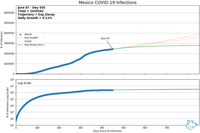
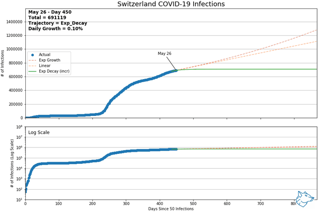
From previous analysis, Mexico and Switzerland were selected to show for comparison. As of May 9th and of countries with > 1000 reported infections and > 14 days reporting, Mexico had the highest daily growth rate and Switzerland had the lowest. At this time, Mexico was on an exponential growth trajectory while Switzerland was on an exponential decay trajectory.
Mexico and Switzerland have been updated to November 13, 2021
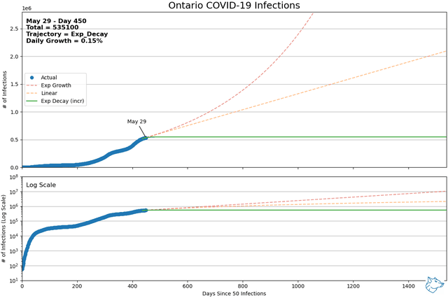
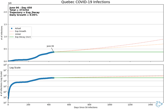
Other Canadian Regions
The following animations show the other regions of concern within Canada

Lessons Learned
The science component of Data Science means that sometimes a lot of code and effort can go into testing and researching a hypothesis only to have to abandon it when the data doesn't yield the desired results. My original analysis was based around using a logistic equation for curve fitting complete data sets to predict peak cases and timing.
# logistic growth model, t = time, K = carrying capacity (peak), Po = initial population
def logistic_model(t,Po,K,r):
    return K/(1 + (((K - Po)/Po)) * np.exp(-1.0*r*t))
The logistic model would be expected to fit a population growth with a finite carrying capacity (i.e. available human hosts). What was observed, however, was no distinct inflection point where the curves shifted from exponential growth to exponential decay. Instead, most data sets exhibited a prolonged linear region. While the logistic model could still be applied, it was difficult to estimate the curve's peak (carrying capacity) with any accuracy. The predicted peaks constantly shifted higher as countries and regions moved along these linear regions.
Note: I make no claims of domain knowledge in the areas of ecology or virology. This analysis is focused on observation and practice of some fundamental data science applications.
Covid-19 Data Source: https://github.com/CSSEGISandData/COVID-19
This is the data repository for the 2019 Novel Coronavirus Visual Dashboard operated by the Johns Hopkins University Center for Systems Science and Engineering (JHU CSSE). Also, Supported by ESRI Living Atlas Team and the Johns Hopkins University Applied Physics Lab (JHU APL).
Thank you to them for making this data available.
Welcome to the virtual home of Phaedrus Technologies where we explore the likes of:
- Industrial Automation
- IoT
- Data Science
- Linux & Open Source
For commercial applications see:
 |
Tetranex Solutions |
|---|